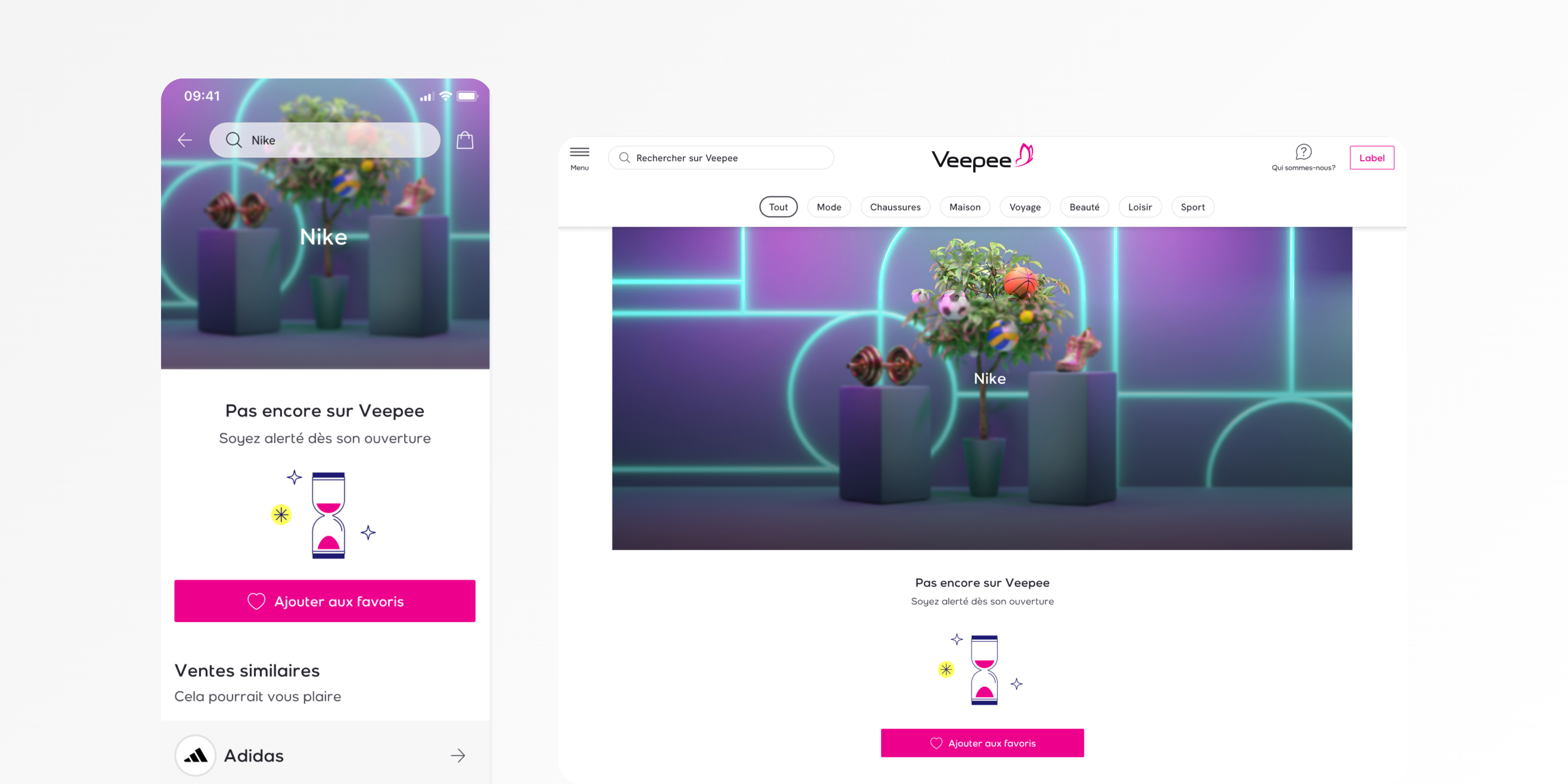
No result page

Redesign of the "No Results" Search Page at Veepee

Client :

Veepee

Category :

Product design, UX research, Facilitator

Start Date :

April 2023

The
Challenge 💪🏼

At Veepee, our search bar is a key feature that allows users to quickly find specific products and brands. However, before the redesign, when a member searched for a product or brand that was unavailable, the platform simply displayed similar products without clearly indicating that the original query was unavailable. This created confusion and frustration among users, as they didn’t know whether their search term was incorrect or simply out of stock.

The main challenge was to improve the experience for users when they couldn’t find what they were looking for. We needed to:

  1. Provide clear feedback about the unavailability of a product or brand.
  2. Offer relevant alternatives to guide users in finding what they wanted.
  3. Encourage user engagement through features like availability alerts for out-of-stock items.

My
Role 🧢

As a Product Designer, I led the redesign of the “No Results” page, collaborating closely with the product team and business. My responsibilities included:

  • Collecting user insights to identify pain points and user needs.
  • Designing the user interface (UI) and user experience (UX) for the new page.
  • Iterating on designs based on user feedback and testing.
  • Working closely with developers to ensure the design was implemented correctly.

Insight &
User research 🔎

To understand the core issues users were facing, I conducted several rounds of research, including:

  • User Interviews: We spoke with members who had recently encountered the “no results” page to understand their feelings and frustrations.
  • Analytics Review: We analyzed click-through rates, bounce rates, and user behavior on the existing “no results” page to spot trends.
  • Competitive Benchmarking: We also looked at how other e-commerce platforms handled “no results” pages and what solutions they offered.

Key insights included:

  • Unclear Communication: Users felt frustrated because they weren’t sure if the product was out of stock, unavailable, or if they had simply made a typo in their search.
  • Frustration with Irrelevant Suggestions: Users expressed dissatisfaction with being shown unrelated products, especially when they were searching for a very specific brand or product.
  • Desire for Alerts: Many users wanted to be notified when the product or brand they were searching for came back in stock.

The solution

Based on the insights gathered, we designed a new “No Results” page that addressed the key issues while enhancing the overall user experience:

  1. Clear Unavailability Message:
    • The new page clearly states when a product or brand is unavailable, with a message such as “The product/brand you’re looking for is currently unavailable.”
    • This message is prominently displayed, ensuring users understand the situation immediately.
  2. Availability Alerts:
    • A prominent button allows users to sign up for an alert when the searched product or brand is back in stock. This feature helps retain user interest and keeps them engaged even if their initial search was unsuccessful.
  3. Similar Brands and Products:
    • Instead of showing unrelated products, the page now features a carousel of similar brands or products. The recommendations are tailored based on the search term, ensuring they are contextually relevant to the user’s original intent.
  4. Refinement Options:
    • We added search suggestions to encourage users to refine their search if they are still interested in finding a similar product. This makes it easier for users to modify their query without needing to start from scratch.
  5. Clear Path Forward:
    • We also included a call-to-action (CTA) to allow users to explore alternative categories or browse through other popular products.

Benchmark đź‘€

We conducted a competitive analysis to ensure that the redesign met industry standards and addressed best practices for handling “no results” pages. Key takeaways from the benchmarking phase:

  • Amazon: Amazon uses a combination of clear messaging and personalized recommendations for out-of-stock items. They also offer a “Notify Me” option for back-in-stock alerts, which was highly appreciated by users.
  • Etsy: Etsy uses a clean, simple design with contextual product suggestions and encourages users to search again with different filters. Their approach to transparency and navigation was a key inspiration.
  • Zalando: Zalando includes related categories and brands in a visually appealing way, which helps users discover alternatives when their initial search yields no results.

These platforms shared a focus on clarity, transparency, and user-centric design, which informed many of our design decisions.
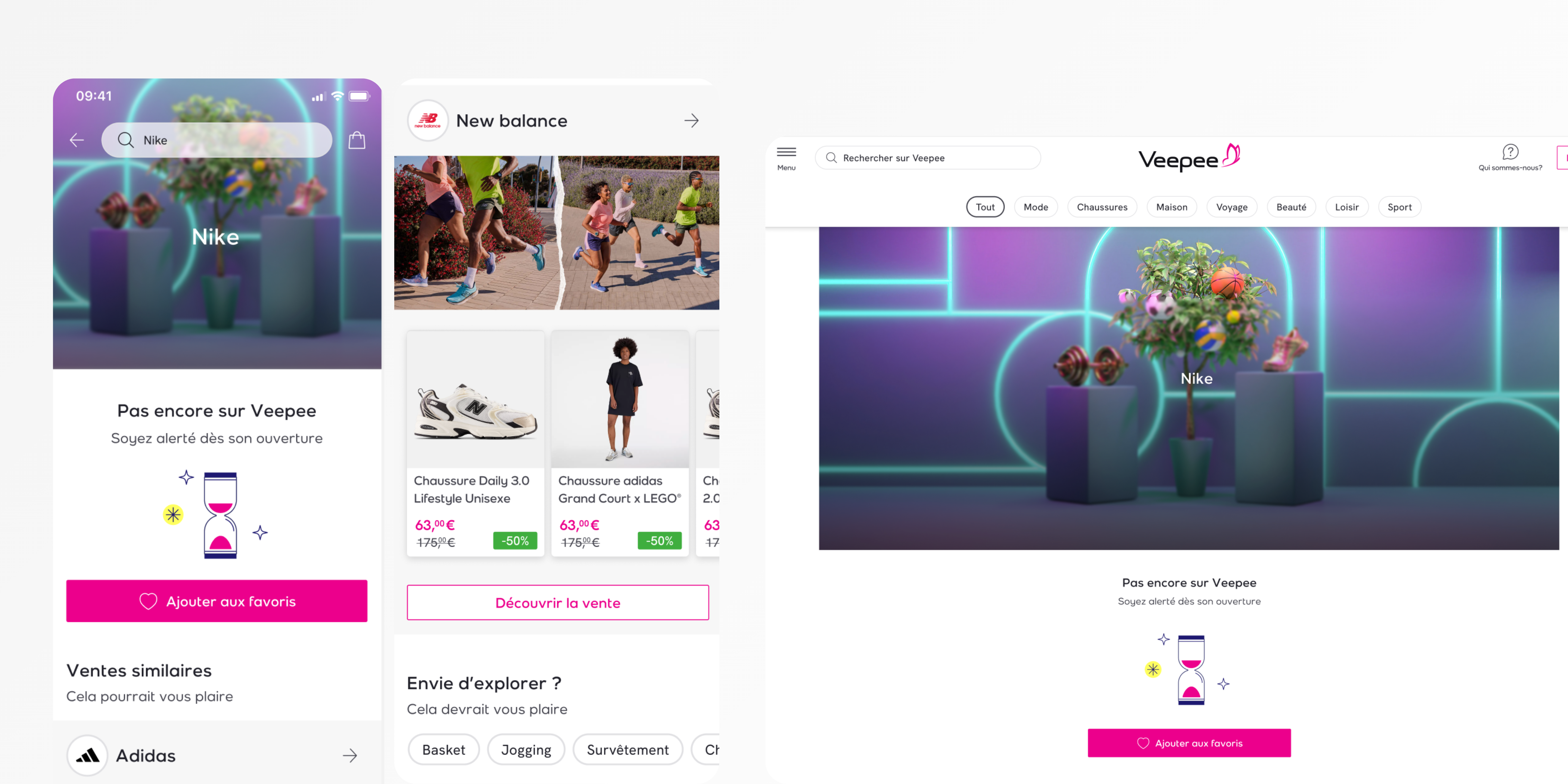
Mockups

Below are some key mockups that illustrate the new "No Results" page design:

Conclusion

The redesign of the "No Results" page at Veepee significantly improved the user experience by addressing key pain points and enhancing user engagement. By providing clear feedback about unavailability, offering tailored recommendations, and enabling alert subscriptions, we not only reduced user frustration but also increased the likelihood of users returning to the site in the future.
en_USEnglish